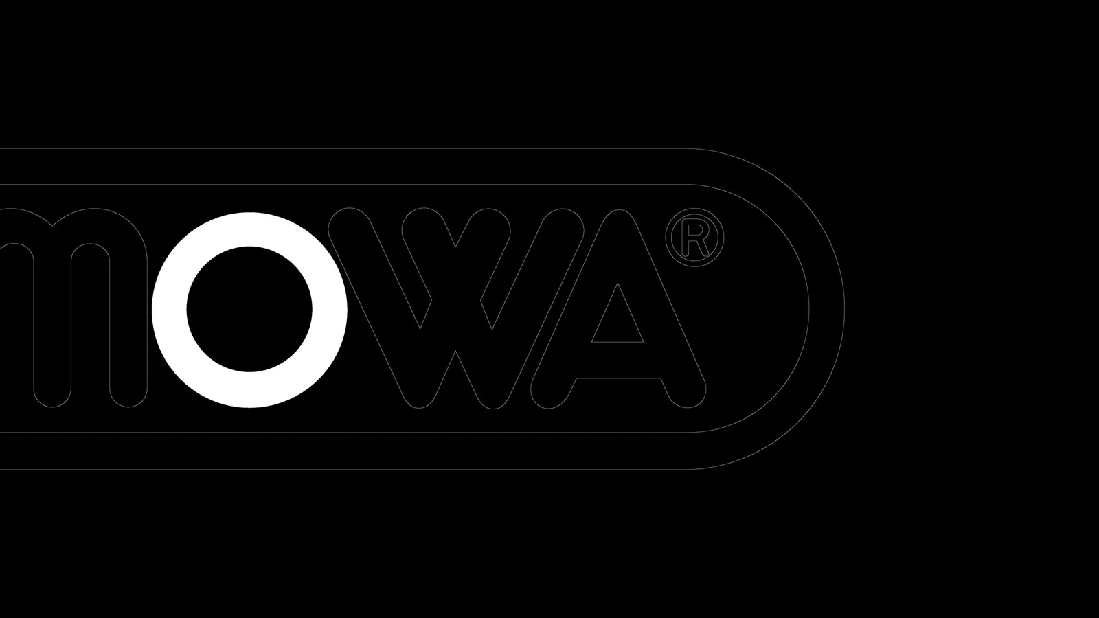
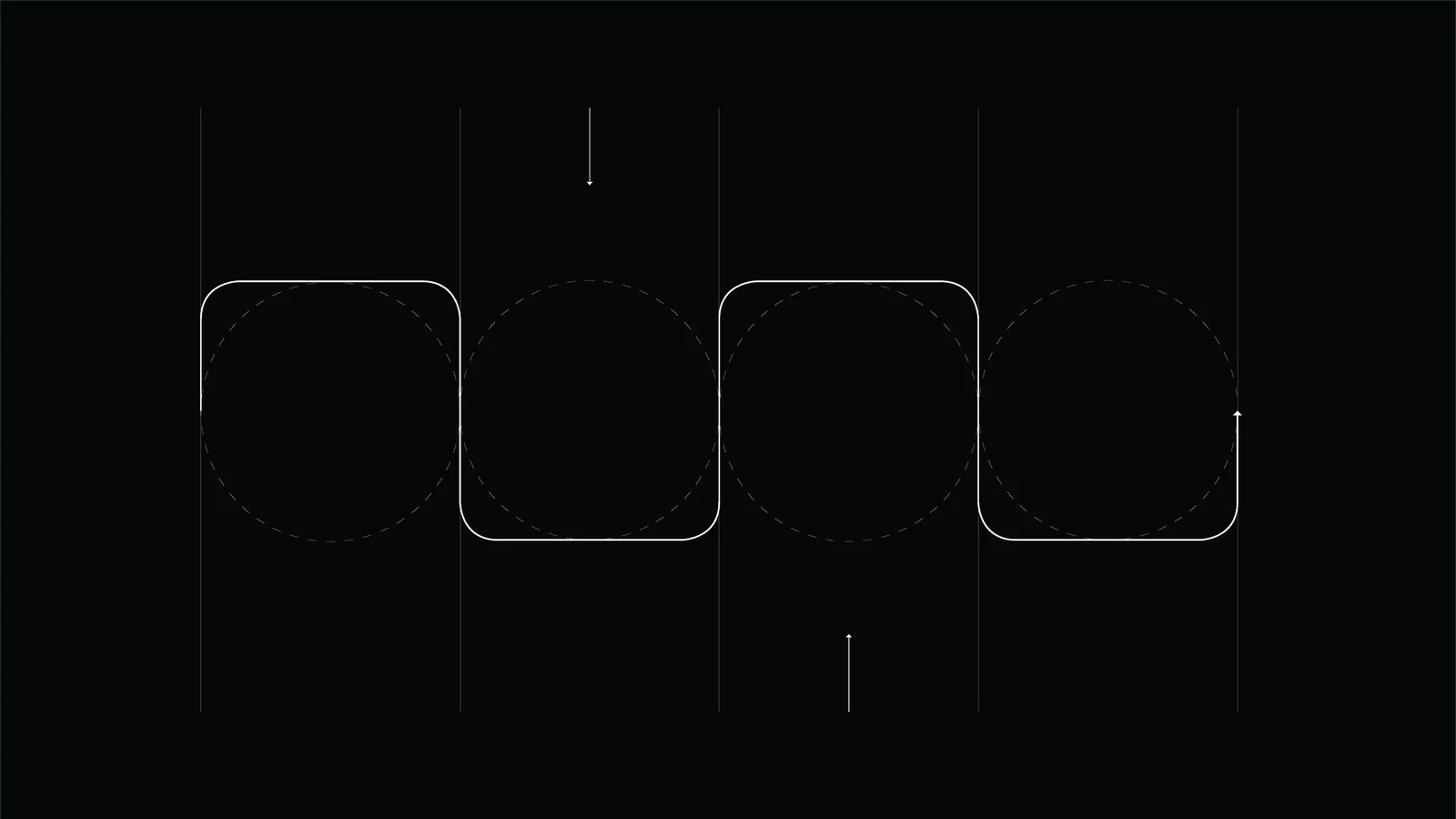
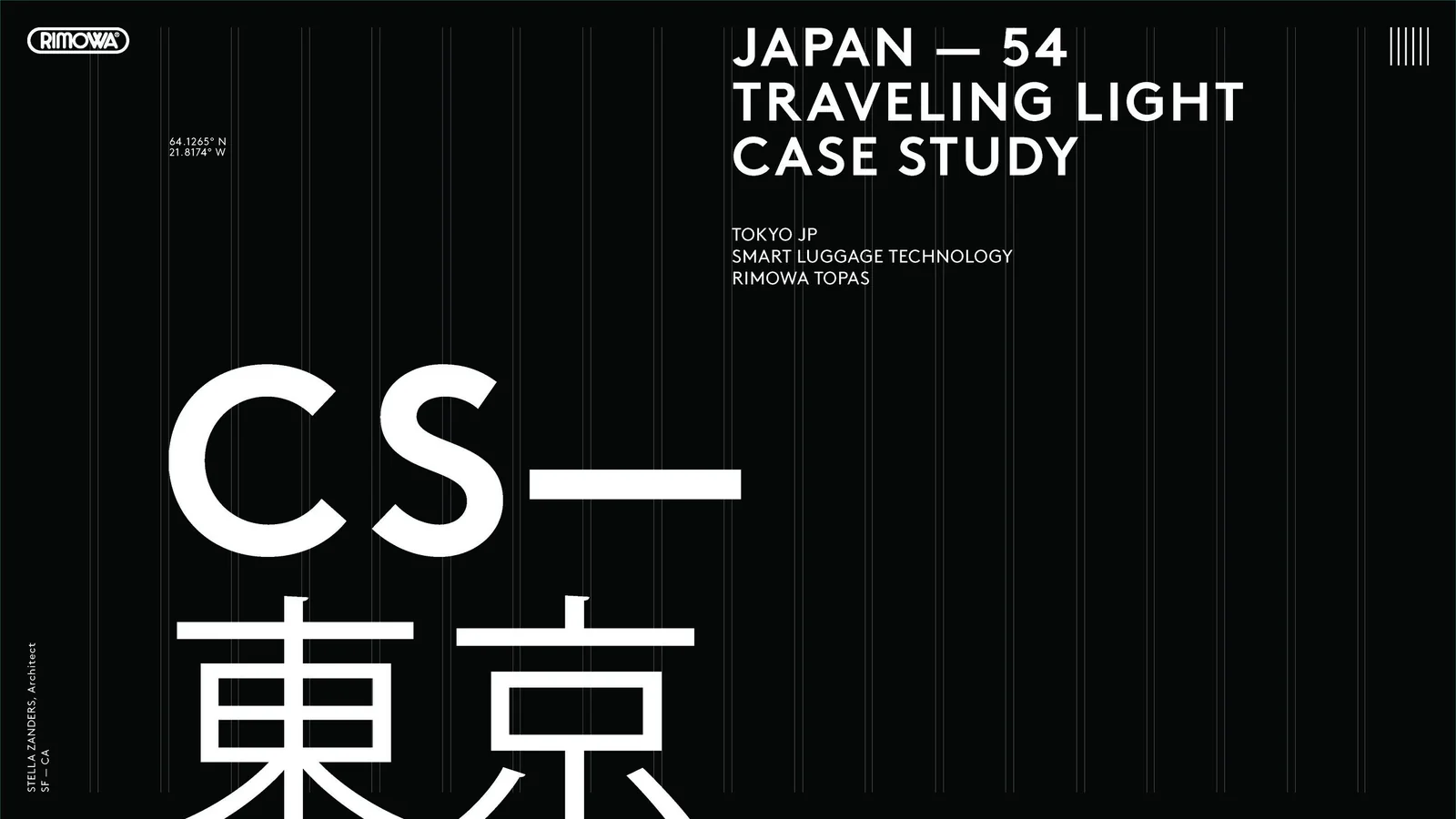
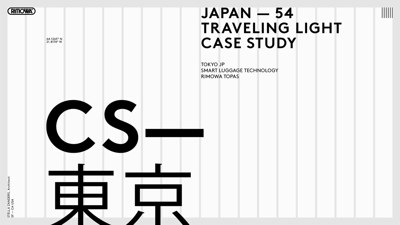
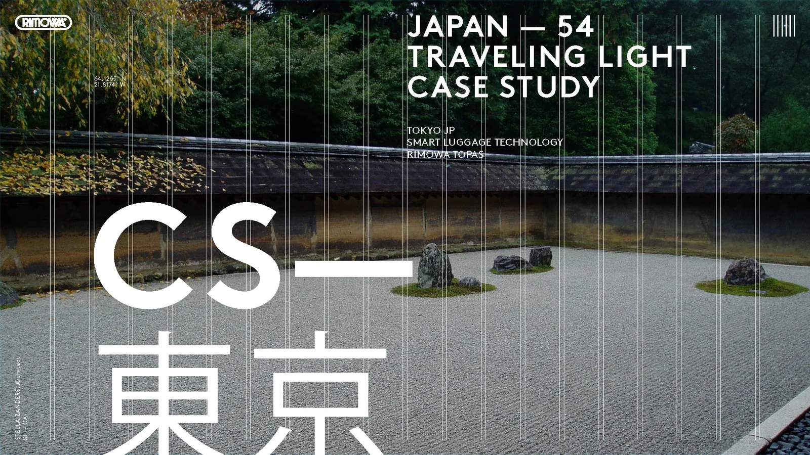
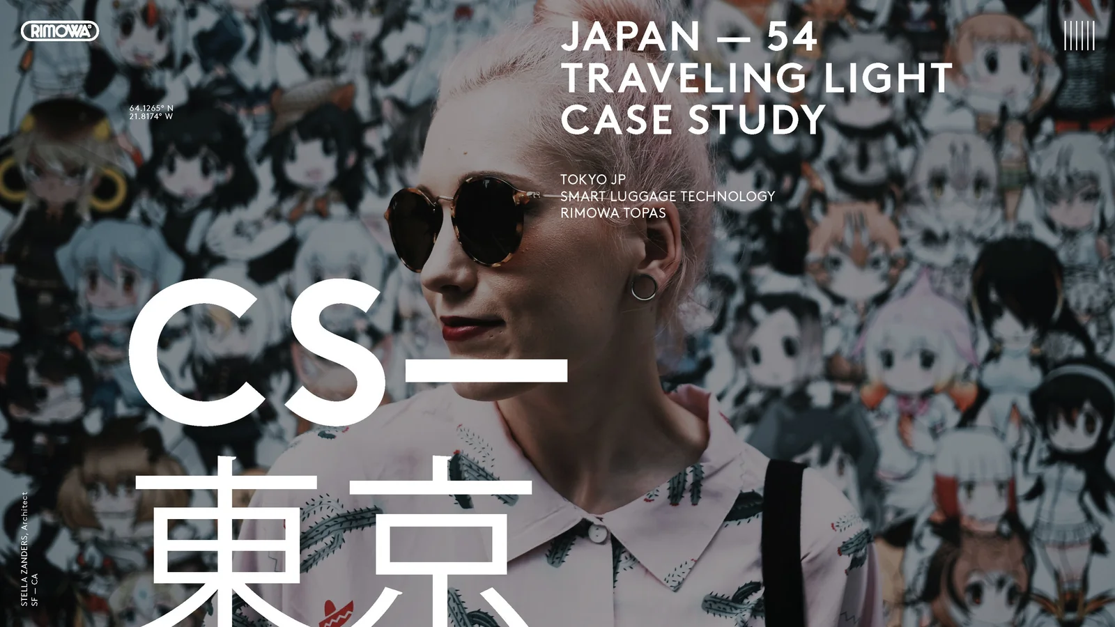
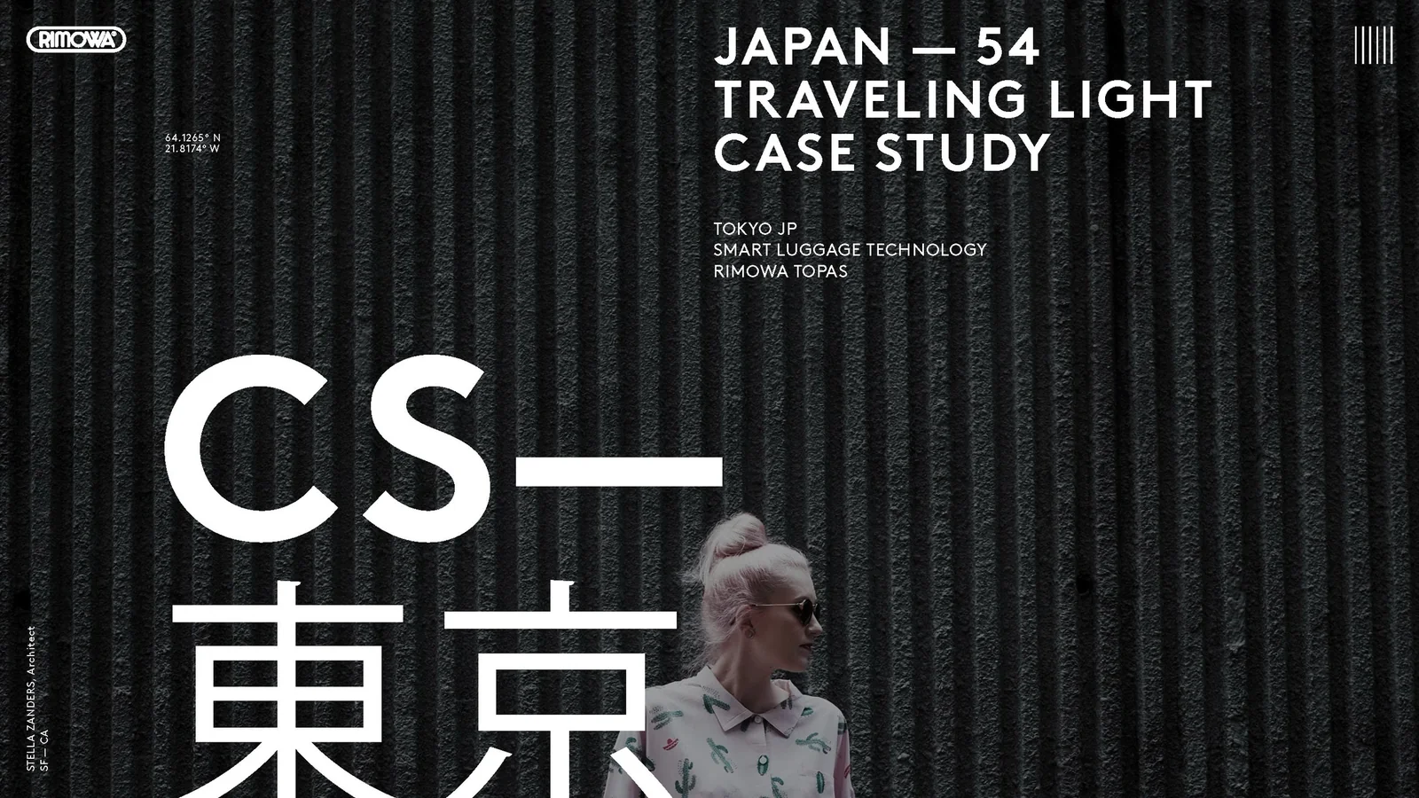
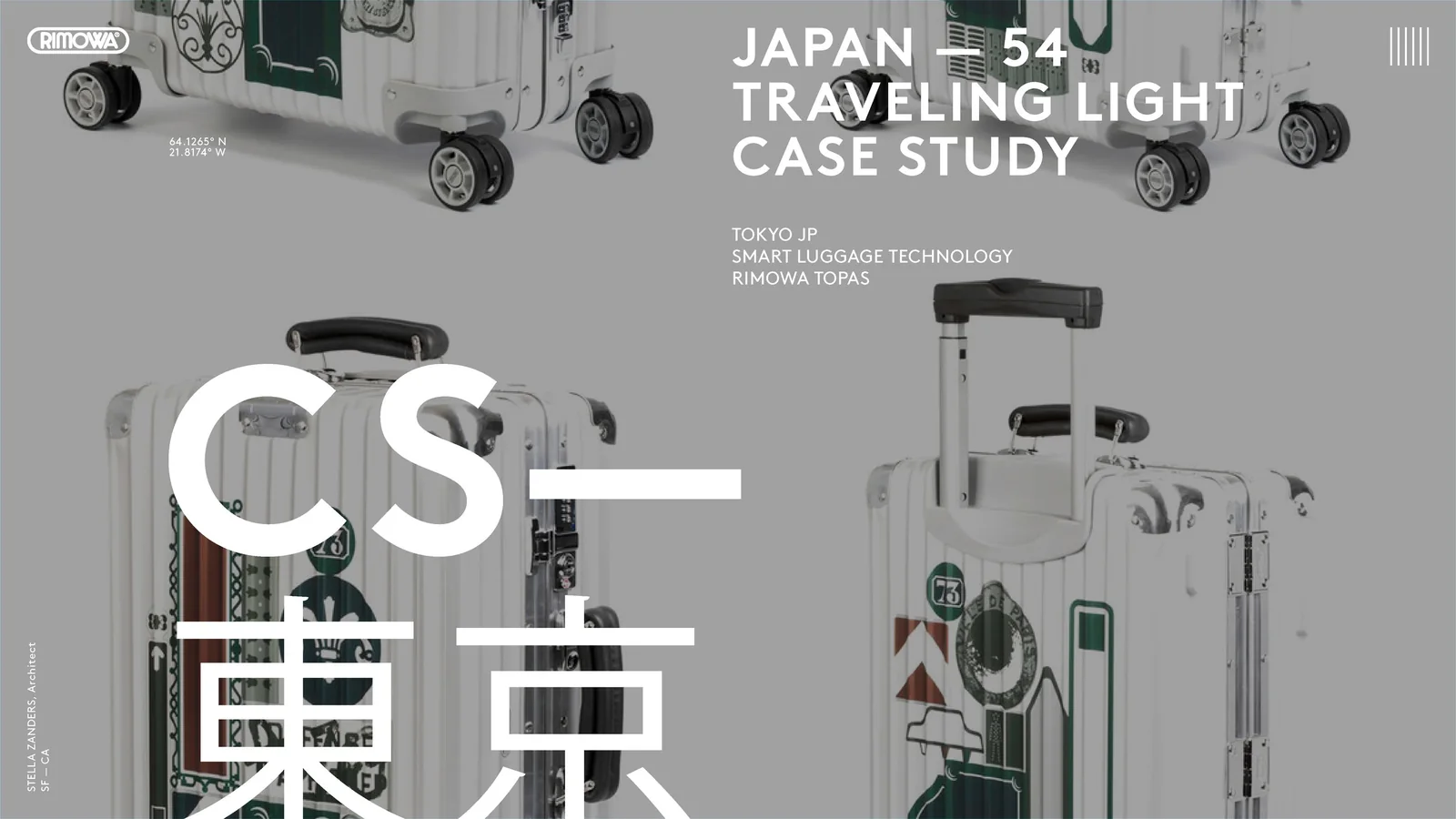
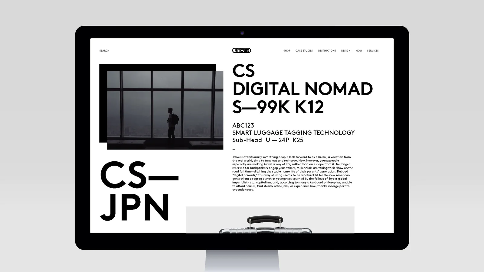
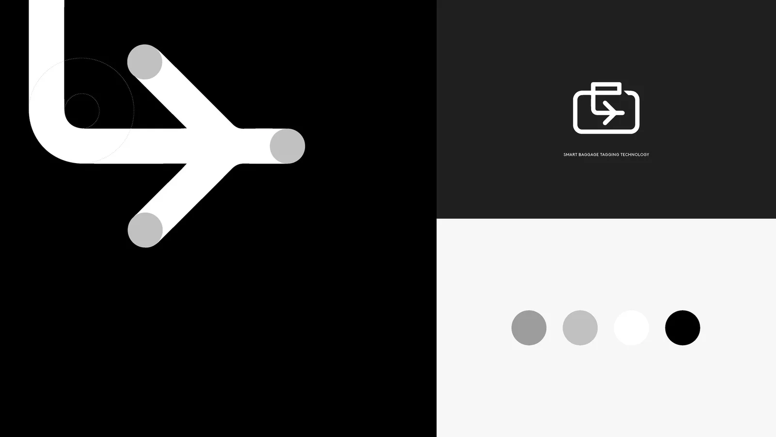
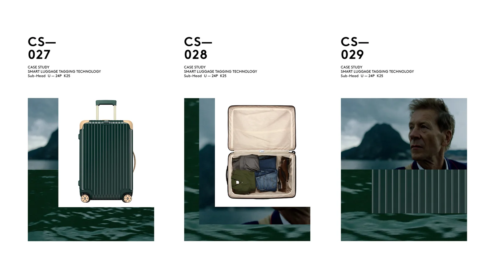
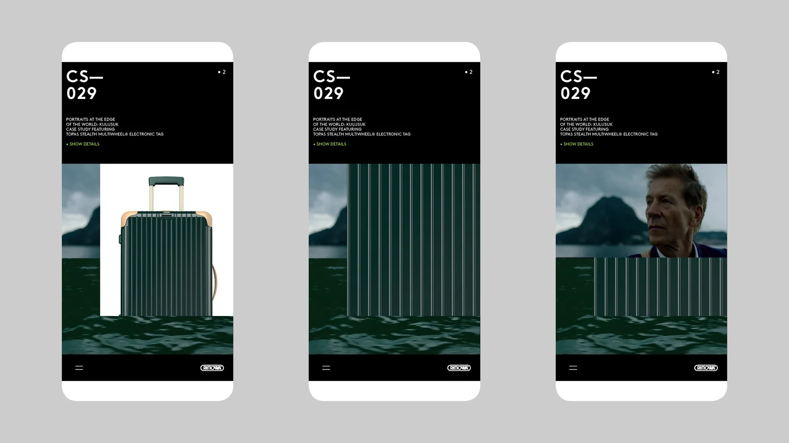
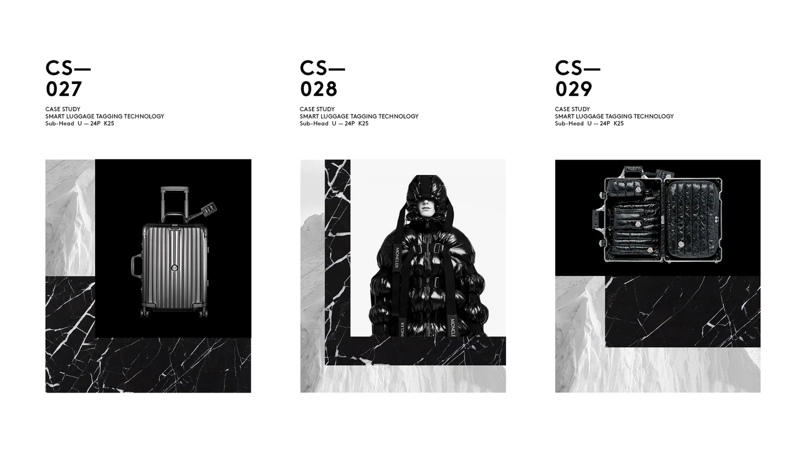
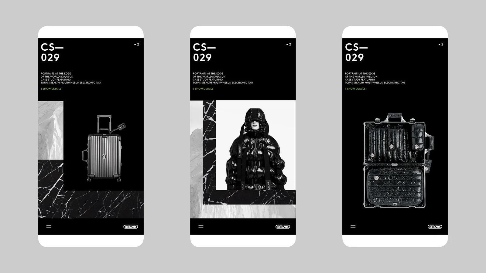
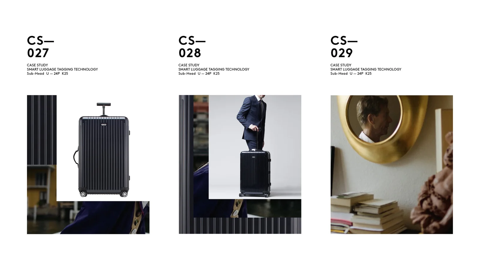
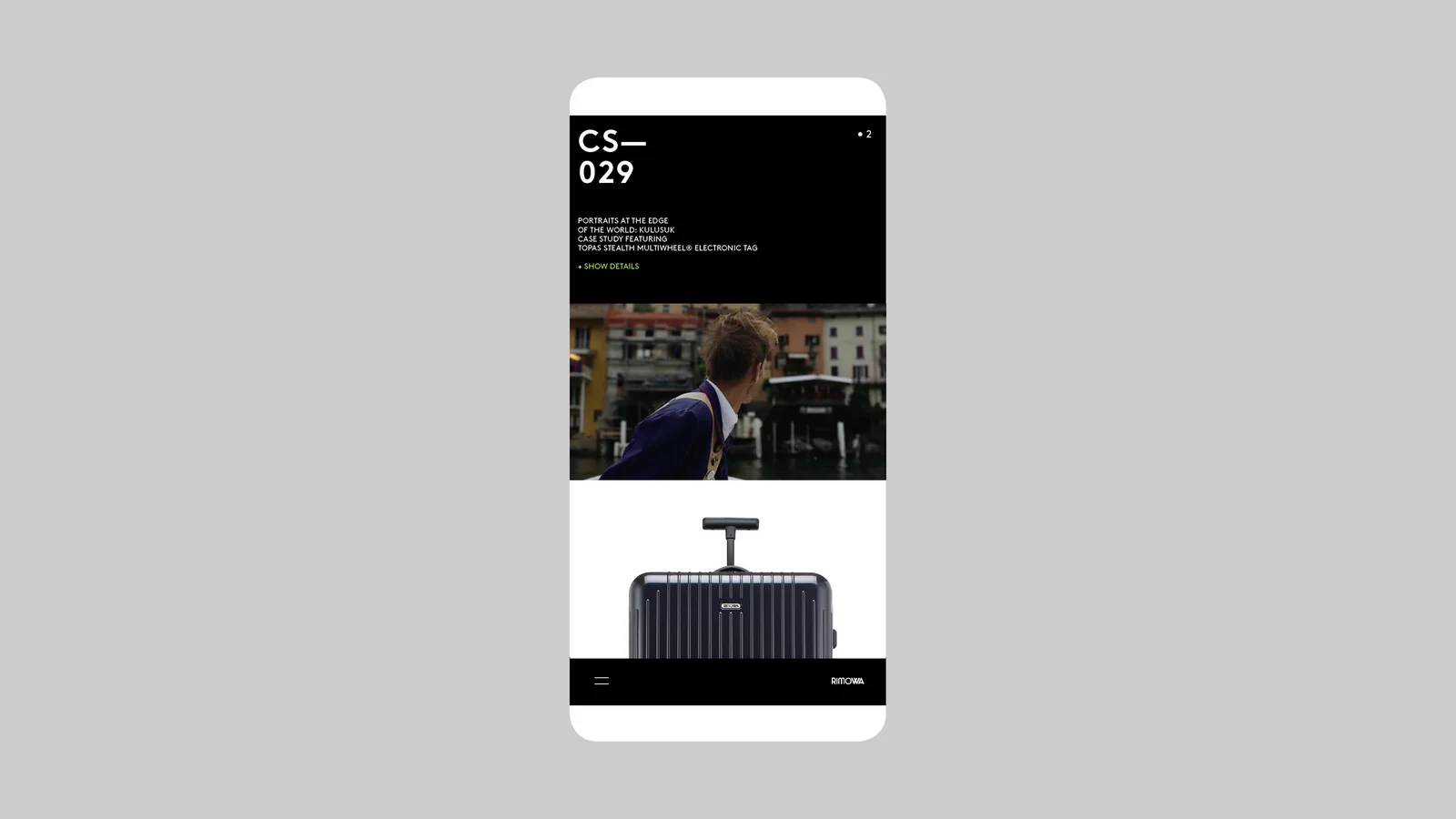
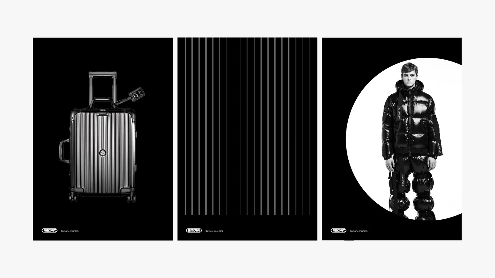
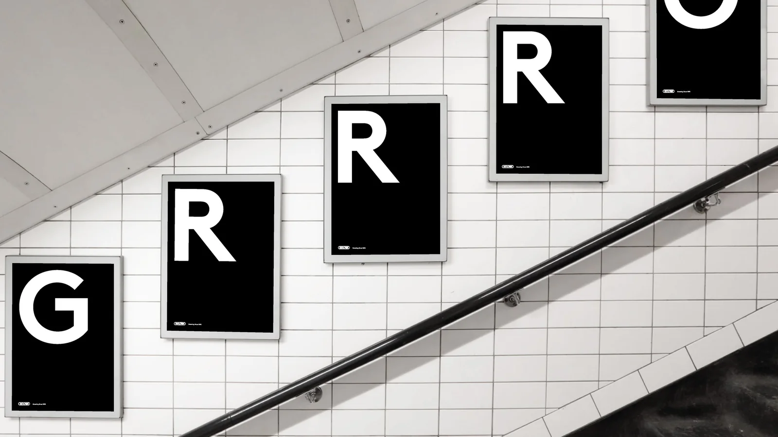
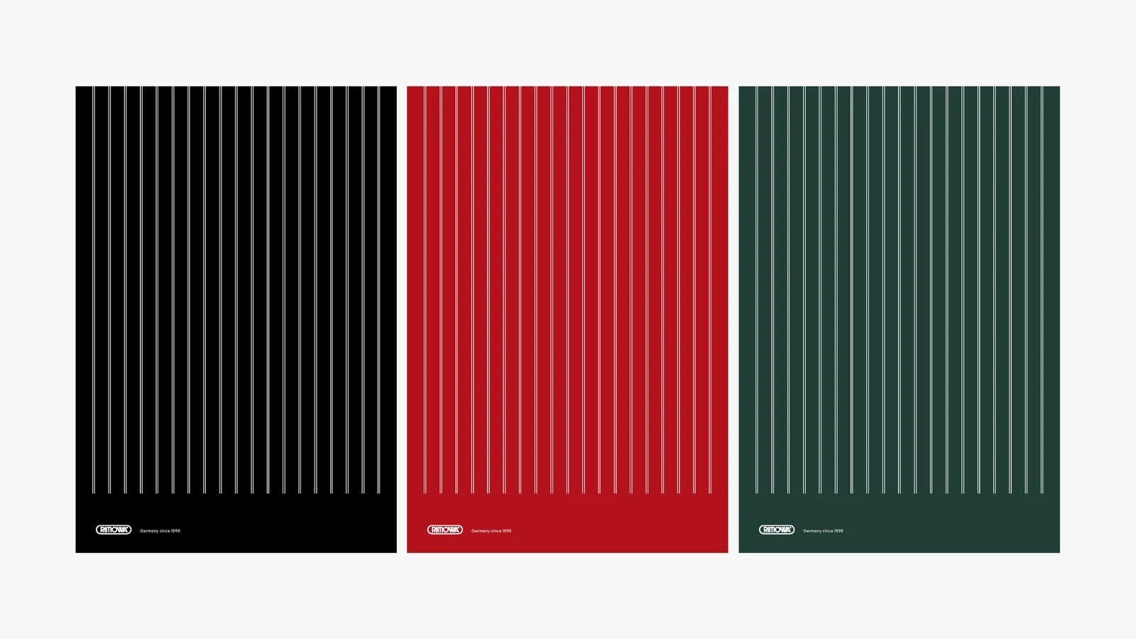
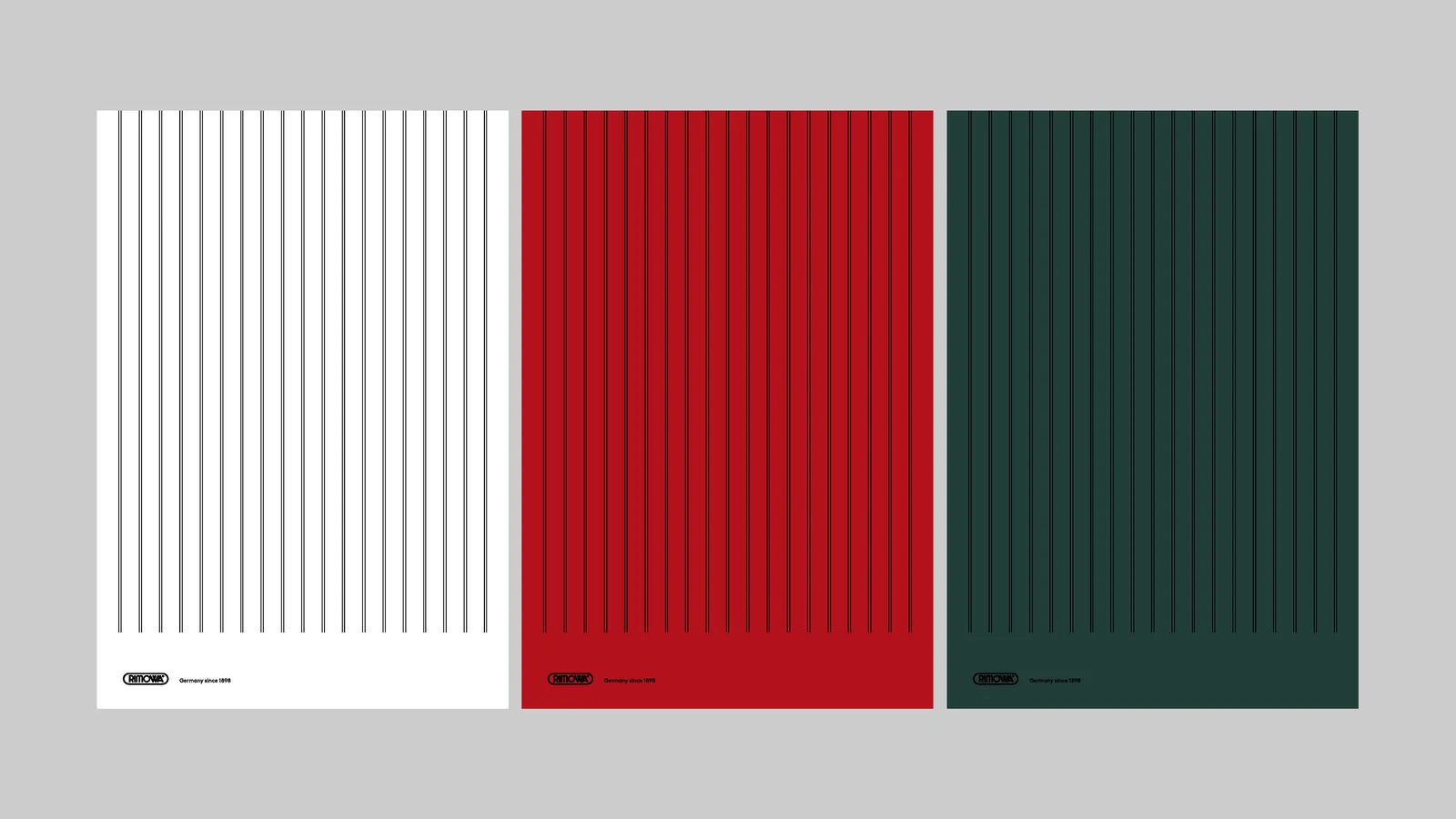
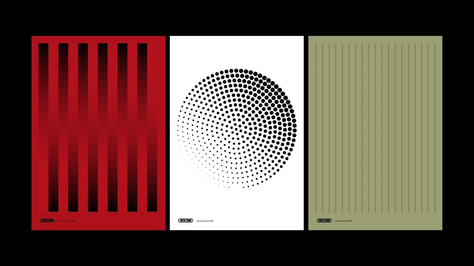
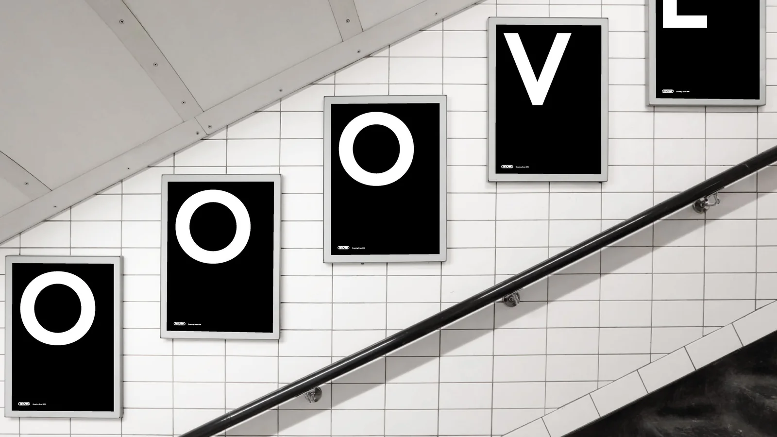
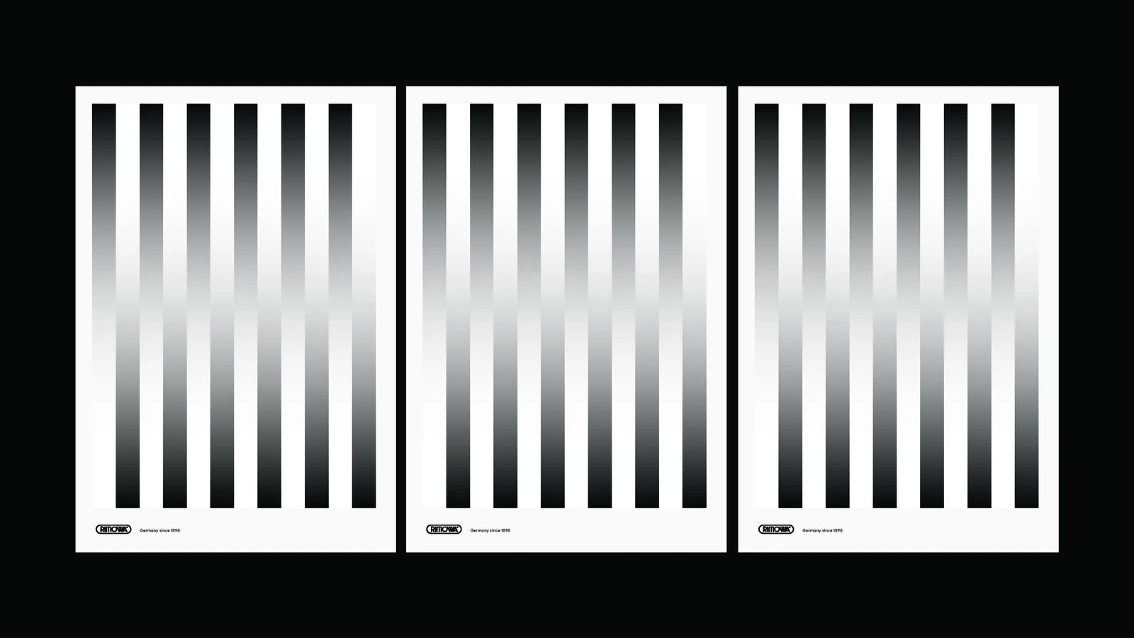
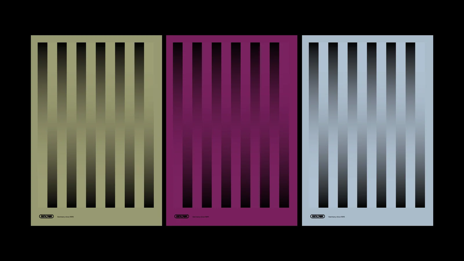
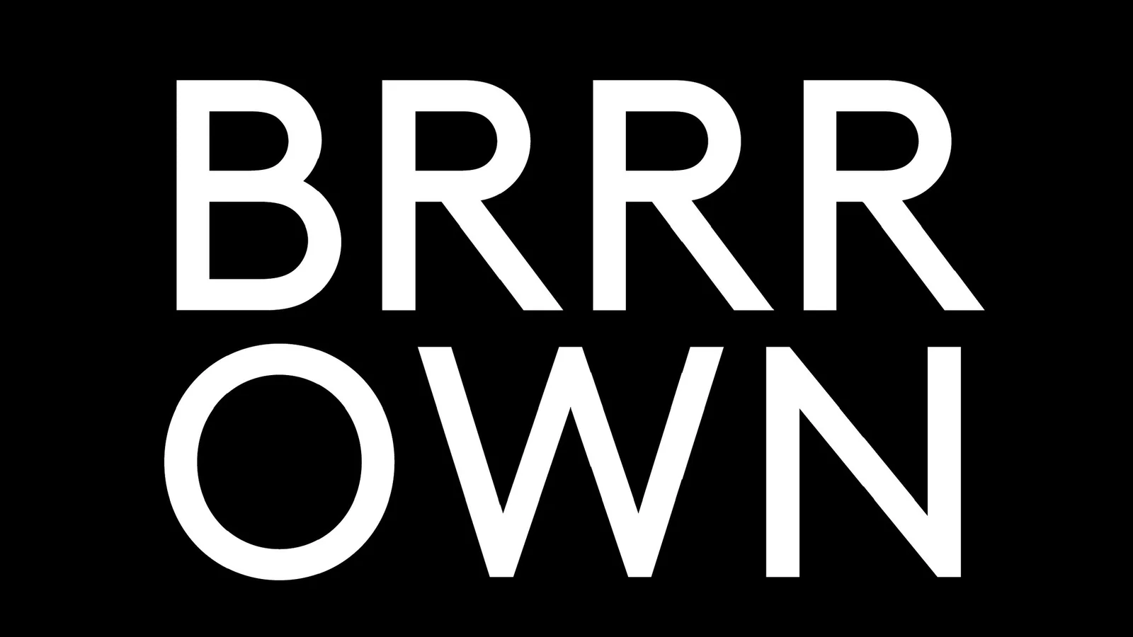
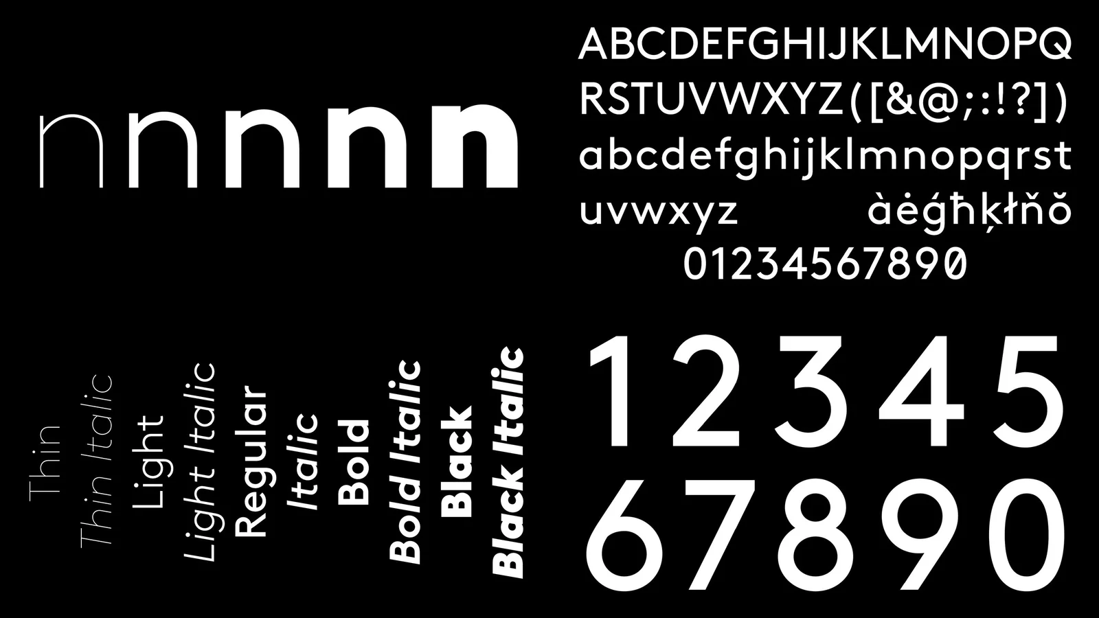
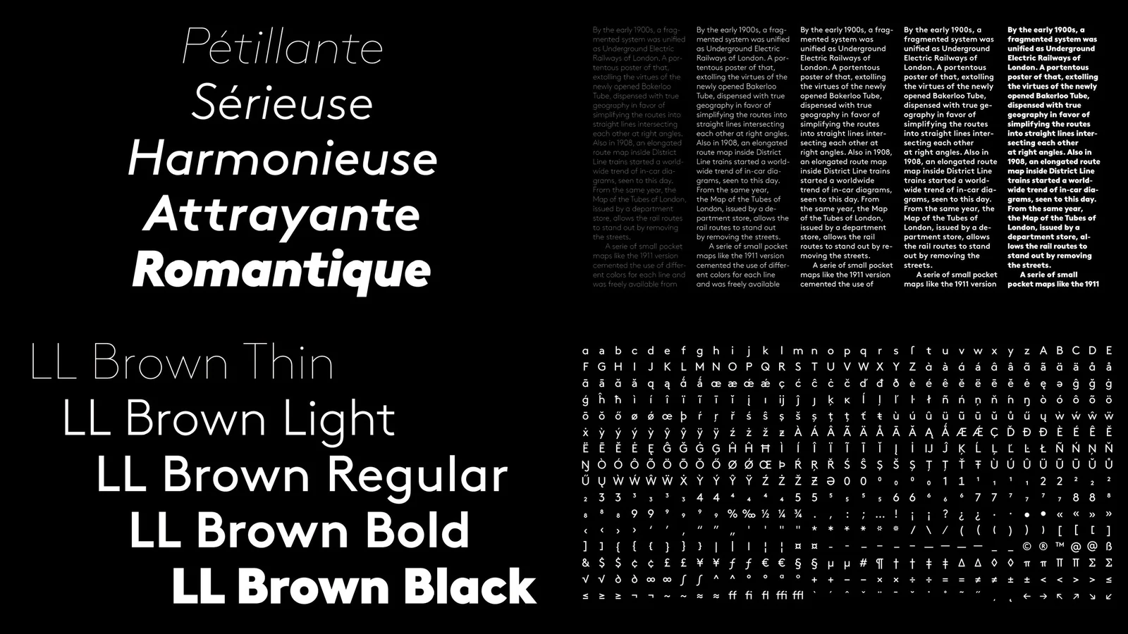
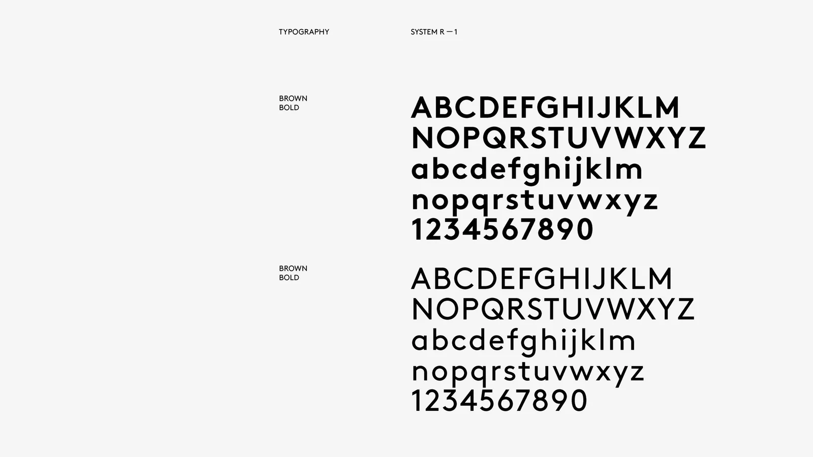
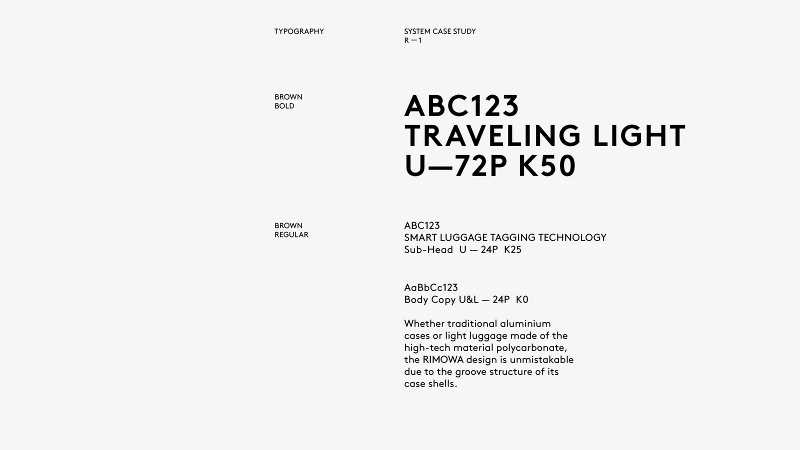
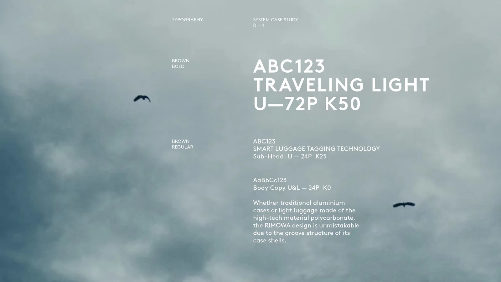
Rimowa, the luggage maker founded in Cologne in 1898 and owned by LVMH since 2016, launched a new visual identity on January 18, 2018, for its 120th anniversary. Bureau Borsche designed the wordmark, and Commission Studio developed the monogram, typeface, pattern, palette, and packaging. R/GA did the digital and brand experience. I worked on it as Executive Creative Director at R/GA London, where I was from July 2016 to March 2018.
Why it looks like this
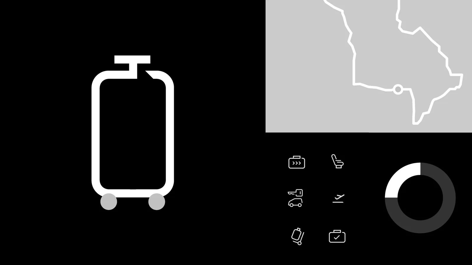
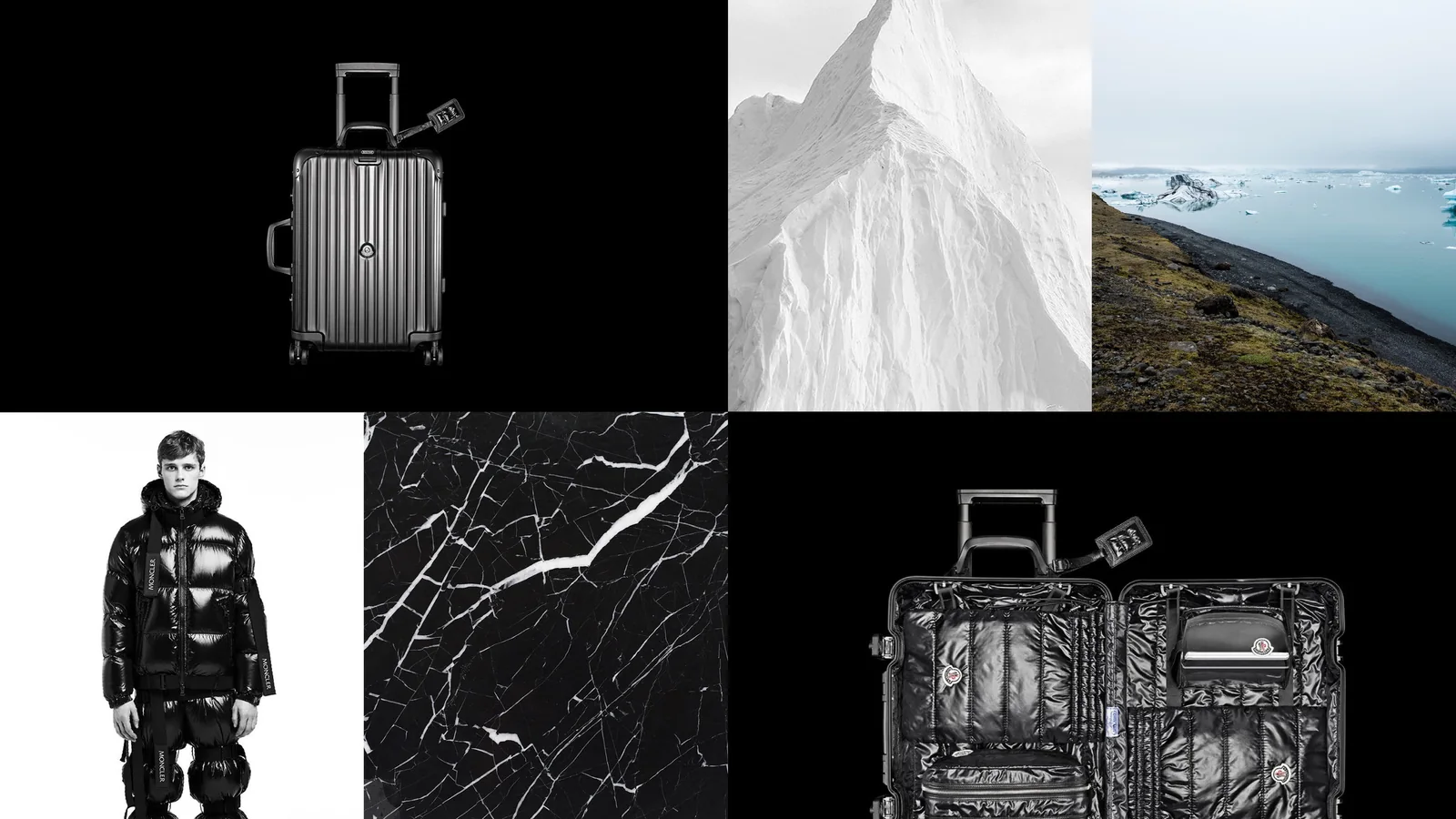
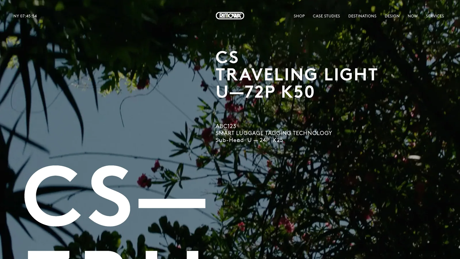
An experience worthy of the product. Rimowa’s announcement said the program set out to “create a brand experience worthy of RIMOWA’s product,” covering a new logo, monogram, visual language, and packaging. Wallpaper reported that the old pill-shaped frame and blue were replaced by a thin sans serif wordmark in black, white, and gray.
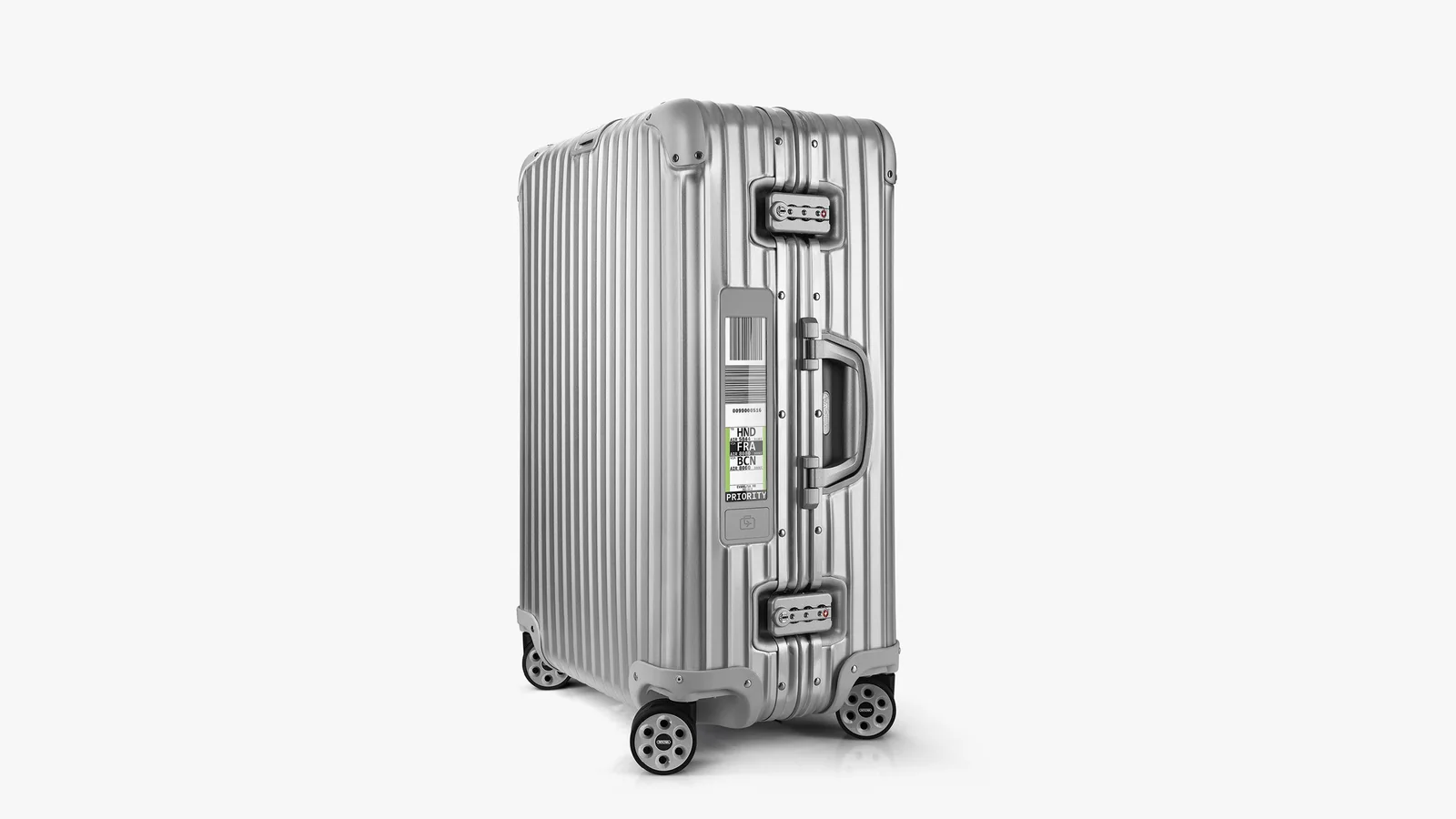
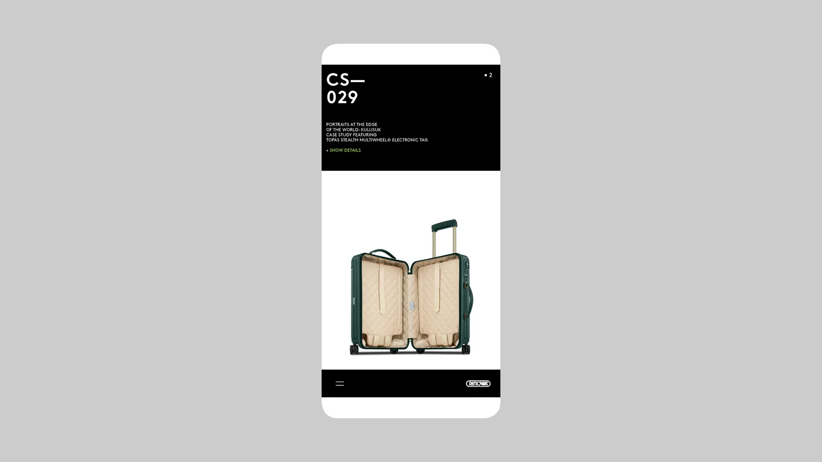
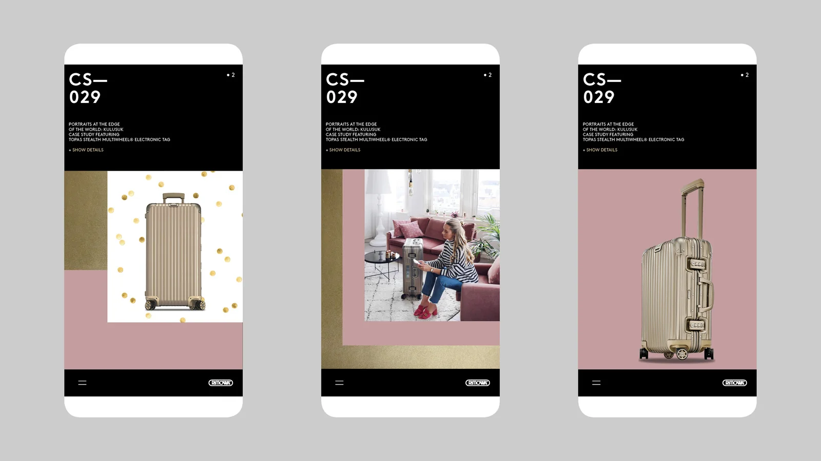
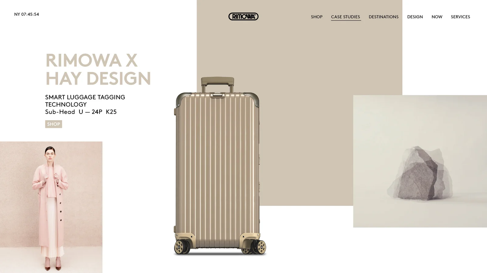
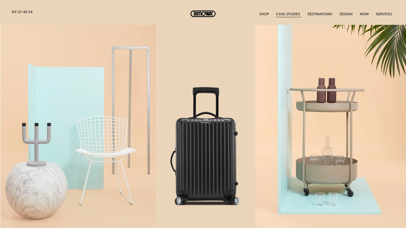
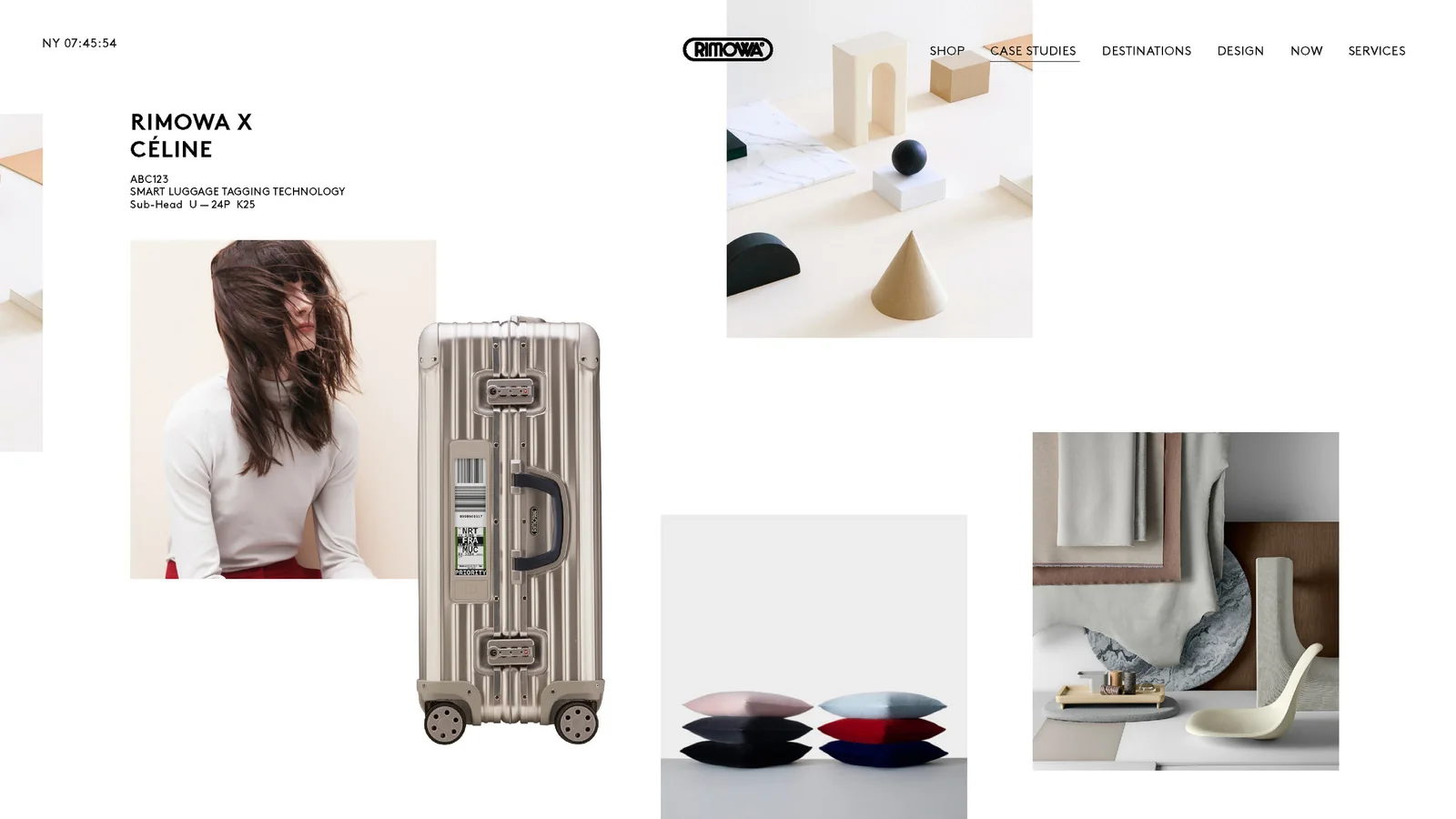
Service over seasons. Glossy reported that the European site built with R/GA London relaunched in June 2018 with Rimowa’s first full e-commerce store, shared store and online inventory, and repair appointments. Chief brand officer Hector Muelas said the brand would focus on “maintenance, repairs and education around craftsmanship.”
Things like product recommendations, new collection drops and seasonality don’t apply to us.
Hector Muelas, chief brand officer, Rimowa, source












Press and sources
- Wallpaper: Rimowa celebrates its 120th anniversary with a new visual identity
- It’s Nice That: Bureau Borsche and Commission studio create a new identity for Rimowa
- MarketScreener (LVMH release): RIMOWA presents new visual identity
- Glossy: Rimowa is launching a new online identity under LVMH ownership